
NEUFUND Blockchain
investment platform
Lead UX/UI Designer
Task I was invited to design the UX and UI for Neufund, a blockchain Equity Fundraising platform based on Ethereum, that aims to revolutionize the way investment works and at the same time strengthen the trust in crypto-investment.
Together with the product owner and the engineering team we built the MVP product from scratch.
My work required a deep understanding of the technical and legal foundations, very close work with the developer and a lot of UX challenges along the road. I am super proud of what I designed in less than 1,5 months.
As time was very limited and I designed the UI as well, we worked very closely and wireframes happened mostly on paper. We tested and iterated on implemented features.
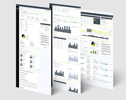
Neufund platform is a very complex product with a lot of user flows that are conditioning each other.
The information and functionality load are very large a and the hierarchy needed to be defined strategically considering many different aspects of the product experience. Then broken down into bits and pieces for the user to deal with without being overwhelmed.
As an only UX designer I worked very closely with the engineers, the business developers and PO in order to understand the process and design a product that works great for users


The challenge was to first even identify all the flows needed and find the intersections between them. Then simplify the structure for the user.
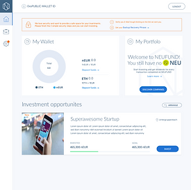
Just to name some of them there is a flow for investment, deposit, registering as an investor (including sub flows for different blockchain wallets), withdraw funds, KYC process for an individual or a company and so on.
All of these included an intersection and interaction with the blockchain network. All this happened, from sketches to in developnemt 1,5 months.
We started with a very clean and modern design, but a week into the process the strategic positioning shifted and we decided to go with a more conservative UI. Here are some samples form the first design direction.


