ORYZA Website Re-launch
My Position Lead UX/UI Designer
Task Oryza Rice website relaunch. The website had to communicate the premium quality of the brand and create a recognizable brand experience.
Challenge No defined brand identity or CI guidelines. Very few market and user research insights. No engagement on current website. The client needed to be able to change any component in the CMS and easily create new stories and products.
Approach and solutions
1. Gathered information about the products and the brand, as well as the main target groups and defined a fundamental storyline for the experience.
While looking at the large variety of Oryza products that is a clear USP compared to other German brands, and the exotic meals one can use them for, I thought how every type of rice comes from a specific place, and has a special story to tell. Experiencing Oryza products, therefore, could be like a journey to a distant country.
I based the UX design on that storyline, and created a cohesive Oryza’s “world rice” experience.
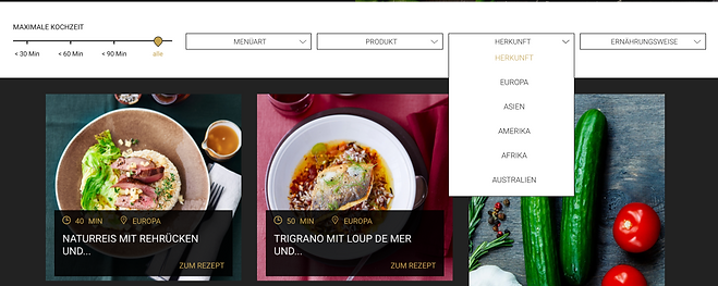
2. Designed an information architecture and guided users trough flows that feel like a world discovery, no matter the entry point. This resulted in a very high engagement.
I created a recipe section and a "Wold of rice" section for rice related articles and structured a lot of related content on each page so the user can keep on discovering and literally goes with the flow.
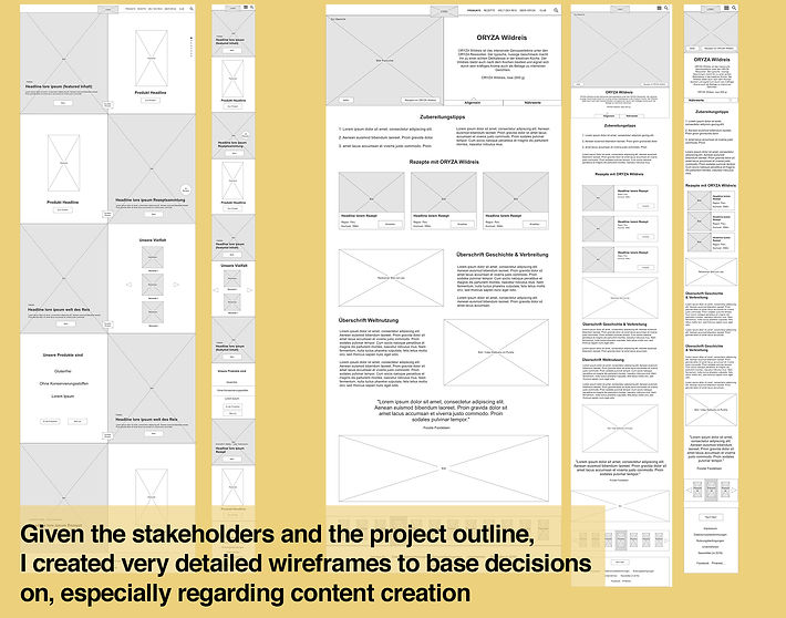
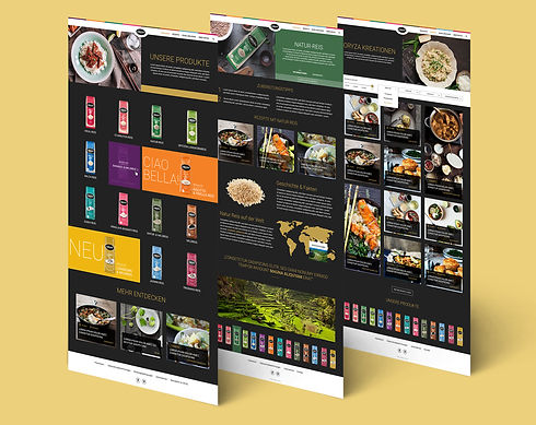
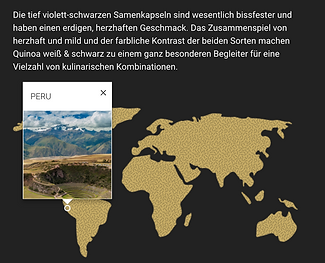
3. The Product page: Each product page is an article about the rice type, telling its own story. A interactive map shows the places the particular rice origins from. Here, the user has the chance to directly find recipes that use that type of rice.
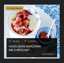
4. The recipe section put rice in the context of use and also the story of origin.
Each recipe teaser shows where the meal comes from. Also, recipes can be grouped in “collections,” which are curated by Oryza and used for holiday times, social media campaigns, etc.
To create he most pleasant cooking experience for the user, we added audio recipes with voice guides.
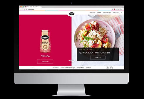
5. The split screen home page is a fun interaction, way more engaging for the user than normal scrolling trough a product page.
It also gives enough space and focus on each individual product and story and feels more premium. I wanted to create a connection between type of rice and experience. I used the split-screen technique to always have a particular rice product next to a story or a recipe.